Wednesday, May 20, 2009

SET. ($3.99, version 1.0.2)


iTunes Link.


Set is a memory game on steroids. The basic premise is to match three cards in which everything is the same or everything is different.


When you first start up the app you have the option to enable or disable sounds. From there you get to a menu with quite a bit of options. You can view your scores for the four game modes and reset them, you can view a tutorial, you can start playing any of the four game modes, you can change settings around, or you can go to a help screen where you can again select the tutorial but where you also can view instructions or an about page.

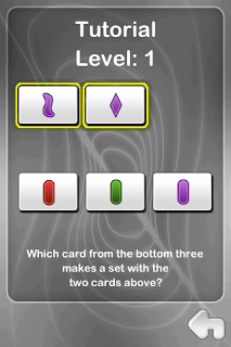
Scores are local only. The tutorial shows you two cards and asks you which card the third one should be and gives you three options to choose from. The settings allow you to turn hints on or off, turn the sound on or off, and choose from three different backgrounds. The instructions explain the gameplay, the difficulty levels, and the game mode. The about screen gives you the developer's website and email address, always welcomed information.


The basic gameplay is to make a set. A set is three card that are either all the same OR all different in each of their features when compared with each other. The features are either color, symbol, and number in the basic difficulty level and color, symbol, number, and shading in the advanced difficulty level.

The game screen includes 9 cards, the timer on the upper left, the current set goal and progress so far in the upper right, the mode towards the bottom center, and a pause button on the lower right. From the pause button you can resume the game or go to the main menu. Games are not saved so make sure you have enough time if you want to complete a full game. It would be great if there were four save states, one for each mode.


There's a lot of replay value because there's four different game both, two timed and two untimed (there's still a timer on the first two modes but it goes up instead of down and there's no time limit). In Classic mode, you have to find 10 SETs in the least amount of time, and every time you make a match those cards disappear and three new cards fill in their spots. In Puzzle mode find between 4 and 6 sets in a single puzzle. It becomes challenging because cards do not disappear when you make a match and you have to keep track of which matches you have found already. In Timed Mode you get two minutes to find as many sets are you can, and you get three seconds added for each set found. Matches disappear and new cards fill in. In Arcade mode you get a certain amount of time to complete a certain amount of sets, and if you find that number of sets you get more time and a higher number of sets to find.

There's music during the menus but not during gameplay. Cards make a swiping sound when selected and you get two different noises when you match a correct or incorrect set. Once you finish you get what sounds like a ghost whispering in the wind.

The graphics are not overly flashy but they don't need to be for a card game.


Now we get to the recommendation. This is a $4 game. I am not going to say it is not worth it because a lot of time and effort had gone into this game. This game was designed by Marsha Falco in 1974 and published by SET Enterprises in 1991. Part of the cost goes into licensing fees. If you're comparing it to Sega and Gameloft, it's cheaper. But it's more expensive than most games out there. Cheaper games climb faster on the sale charts, and now people expect more for a dollar.


Is the game worth it? Yes. Can you get more for your money? Yes. If you have played the card game before and love it, this is a great implementation with lots of features and easily worth the four bucks. But I'm not sure that it has the same longevity compared to what the app store has to offer. Put it at a buck and it's an easy recommendation. In short, the game is fun, polished, and has tons of options, but it's priced in such a way that it delivers less for your money than the competition does.

GridLocked. ($0.99, version 1.2)


iTunes Link.


Ever been stopped at a red light with cars behind you while there's not a car in sight to your left or to your right? Ever wished you could manage those lights more intelligently? Now's your chance. Gridlocked is a traffic management game. You have four crossroads and have to manage four sets of traffic lights in order to keep traffic moving. Keep cars waiting too long and you lose.

When you first start up the app you get a choice to turn sounds on or off. You cannot change this unless you restart the app. Adding an options menu with a volume switch would be a welcomed addition. A nice feature is that it has music playthrough so if you choose no sounds your music will play through. Once you select whether you wants sounds or not, you get a menu that allows you to play, view a tutorial, view statistics, and view the high scores. The tutorial goes over what the goal is, what the different-colored cars mean, and controls. It's only two screens since there's not much to learn in order to get cracking.


In order to view the high scores you will need an Internet connection, since it only shows global high scores. You can post your highest score to the scoreboard. It shows the top 25 scores, and the top dog gets a little thumbs up icon next to their name. Statistics include your highest score, your last score, how many games played, and most cars that have passed through the intersections in a single game.

From the game screen you have your current score at the top and a pause button on the lower right-hand side of the screen. The pause button brings up a menu that lets you either continue or end the current game. The game screen is what could be called a suburb. There's a parking lot on one corner, a couple of houses, a lake, and lots of trees. The treetops over the houses are see-through, so that you get a feeling that you can see the houses through the branches. The graphics are drawn and while not overly flashy, they serve the gameplay well. There are three types of cars: regular sedans, trucks, and ambulances. It's not explained whether ambulances change color faster.


The cars will change color depending on how long they've waiting at the intersection. White is the default color. White will turn first to yellow, then to orange, and then to red. Once it gets to red you only have a few seconds to get it moving or it's game over for you.

The intersections don't actually have tragic lights, they just have arrows that show which way the traffic will flow, up-down or left-right. If you change the arrows while a car is crossing the intersection and a car is coming the other way, the other car will just wait. There are no crashes in this game; everyone politely waits their turn if you happen to mess up the timing.


As the game progresses, the traffic starts to get bottlenecked. You may turn the arrows on the upper right intersection to go from up-down to left-right to get rid of some upper horizontal traffic but no one can move because the upper left intersection is turned up-down, and there are cars waiting there already. So it's not possible to save a game by just managing one intersection change; you have to also take into account the other intersections.

Your score doesn't increase each time a car passes the intersection, it just increases by one ever second or so. I found the game relaxing until about 200 or so, at which time it start getting a bit frantic. At the end you end up tapping around like a maniac trying to get rid of bottlenecks.

Sounds are minimal with some techno background music. The cars don't make a noise, while the trucks honk once and the ambulances have a short siren.


This game is incredibly addicting. You wouldn't think it would be this much fun to direct traffic. The addition of global high scores may keep you coming back for more. The current game is not saved if you exit the app or go back to the main menu, so if you're going for a high score you might want to schedule in some time before starting. This game is a perfect pick-up-and-play game. For a dollar, this is a worthwhile investment and a nice diversion.iTu

Monday, May 18, 2009

Durak. ($1.99, version 1.1)


iTunes Link.


We are giving away FIVE promo codes!! Please read more about the contest at the end of the review.


Durak is a very well-known Russian card game. You're not really trying to win, you're just trying not to lose. The last person left with one or more cards at the end loses, so there can be more than one winner but only one loser. Durak means fool in Russian and, if you're playing the game in a Russian bar and lose, you may end up having to squat down and walk around the bar clucking like a chicken.


The interface is extremely polished. From the main menu you can pick a single player game against the PC, a multiplayer game, go through a tutorial, adjust the settings, or get some information about the game. The game information screen includes the developer's website address and if you click where it shows ''E-mail Us,'' it opens up the iDevice's email app with the developer's email address already filled out for you, which is a nice touch. It's frustrating when developers don't include any contact information and their iTunes website and support links lead to nonexistent websites or websites with generic information and no way to get in touch with them. It's refreshing to see a developer go out of their way to make it easy for you to contact them and even ask for any feedback. It would be great that instead of just showing ''E-mail Us'' it would show ''E-mail us at info@losttoken.com'' while still being clickable.  

From that same screen you can click on Invite a Friend and it will open up the email app with the subject of "Durak game'' and a pre-written message that says ''Look at this cool game!'' and has a link to the game and a gameplay image and also has a link to the developer's website. All that's needed is to put in an email address and click send. On that same screen you can click on the developer's website address to go directly to their page. I think they want to be reached.

In the settings you can turn the music, sound effects, or turnovers on or off. Turnovers refers to the game rule that you can match an attack card with a card that has the same value (more on that later). You can also choose from three difficulty levels and card style. The default card style is red and white on the back and you can choose another card style from any of your pictures in the iDevice. This is a very nice touch. The changed card style even shows up in the menus, giving the whole game a real feel of interactivity. It's little touches like these that make a game stand out.


The tutorial is very comprehensive and walks you step-by-step through a staged game, teaching you the basic rules. Each player gets six cards, and your goal is to get rid of all cards. Cards go from 6 to Ace. At the beginning of the game a ''Trump card'' is chosen and placed beneath the rest of the deck (after each player's cards have been given out). Any card from that suite trumps any card from any other suite. So if the trump card is the ten of diamonds, a two of diamonds will trump the ace of spades.  

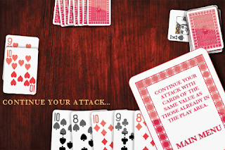
As you get rid of your cards, you will receive new cards from the deck until it runs out, always having six cards at the end of your turn. The game rotates clockwise. The first player places a card on the table and the next player can ''defend'' from the ''attack'' by placing a higher card of the same suite or a trump card. If an attack is defended, you can do one of two things. You can continue the attack or you can end your attack by double-tapping the table. This is where most of the game's strategy comes from: what to play and what to keep. You may not want to play higher cards early in the round, because as soon as your opponent cannot defend against your attack, they grab all the cards on the table. So if you played many high cards, they are now in the hands of your opponent.

If you want to continue your attack, you can play any card with the same value as any of the cards on the table (you can attack with anything when you first start your attack). So if the table has a 2, ace, and king, you can place any 2, ace, or kind, regardless of the suite. I think the game could make this clearer, as the tutorial says you can play any ''matching'' card but this doesn't apply to suite, so it would be better if it said something like you can play any card with the same ''value'' as any card already on the table.  

If you don't have anything else to attack with, you can double tap the table and the cards go into a "graveyard'' (instead of going to your opponent, which only happens if you attack and they cannot defend). Once the cards reach the graveyard, they stay there.  

Turn-swapping boils down to this: if your opponent can't defend against your attack, they take all the cards on the table and you attack again. If they can defend and you give up attacking, the cards go to the graveyard and it's your opponent's turn to attack.  

A special rule, called a turnover, is that if your opponent is attacking you can counter-attack by placing a card of the same value on the table. Your opponent then has to defend against both cards. But be careful, as your opponent may place yet a third card of the same value on the table and now you have to defend against all three cards. If you can't, you take all three cards. If your opponent attacks, you can actually throw in multiple cards of the same value and they have to defend against all of them. Once you are ready putting cards in, double-tap to allow your opponent to defend. If your opponent can't defend against your first attack, the game allows you to throw in additional cards of the same value before your opponent has to take the lot. This give-and-take of attacking and defending goes on until only one person is left with cards.


That's pretty much the game. Try to get rid of your cards, try to defend with as low cards as possible, and try to save all your high and trump cards until the end.

In single player mode you can choose one, two, or three opponents. Multiplayer is Wi-Fi only. The game looks very polished, and the table has a nice wooden finish. It would be great to also be able to change the way the table looks with our own backgrounds; that would just be icing on the cake. From the play table you can tap on the question mark on the bottom right and get tips about what to do next (not strategy tips, just gameplay tips). The game also lets you know if you should be attacking or defending.  

When you are playing more than one PC opponent, player one attacks first. If Player 1 (P1) decides to end their attack after P2 has successfully defended, P3 and P4 (in a 4-player game with you and 3 PC opponents) can continue your attack. If P2 defends successfully, you get to go yet one more time. If P2 successfully fends off all attacks, it's their turn to attack. If they can't defend the extended P1-P3-P4 attack, they grab the cards on the table and they don't get to attack next because they lost the attack. P3 would go next and would attack P4, and then P1 and P2 can join in the fun of attacking P4.  

Who goes first depends on what level you are playing. You will always start on Easy when playing the PC. If you're playing other people or the PC on Normal or Hard, the player with the lowest trump card goes first. If someone doesn't have a trump card but one or more of the other players do, the person without a trump card is automatically disqualified from going first. If only one player has a trump card, they go first. If none of the four players have a trump card, the app will pick the game starter at random.  

Something l didn't notice until right now (literally) is that in the menus you can actually grab the cards to the side and move them around (you can grab all four with different fingers). Another little touch that adds polish to this game.  

There's some nice relaxing music, reminiscent of playing cards at a jazz club. There's shuffling sounds and other assorted sound effects when you move the cards around.
For some reason I had a hard time learning the rules. But it's like riding a bike - once you learn, you never forget. You may want to prepare for a few frustrating hands while you learn the rules. But once you do learn the rules, it's a very enjoyable game. And if you ever go to Russia, you'll be sure to make lots of friends quickly.


The one major suggestion I would have is to save your current game. Each time you go to the main menu, you have to start over. It does save the current game if you exit out of the app and then re-start the app, but it goes straight into the game. So there's no way to go to the main menu (to adjust settings or change the card background, for example) while in the middle of a game without losing the game.

This is a nice change from all the solitaire games out there. It's different, it's well-explained, it's well done, and it just looks good. The cards are easy to read and handle. Highly recommended if you're looking for a nice relaxing different type of card game. It goes without saying that if you grew up playing and loving this game in real life, it should be part of your game library.

You can watch a gameplay video taken by the developer at http://www.youtube.com/watch?v=f7nBGjTnsbw.


Contest: The first person to send the correct answer to intouchreviews@gmail.com will get the code and their desired name posted here. Your subject MUST say "Durak promo code" to be eligible, and must have the answer and the desired name/nickname to be posted here.


QUESTION 1: Who was the first person to walk in space?

Stoneloops! of Jurassica. ($0.99, version 1.00)


iTunes Link.


I can count on one hand how many games I have been obsessed with. Puzzle Quest, Pixel Cross, PathPix, and Stoneloops! This is a rare game (for me) in that I keep coming to it for one... last... time, to try to beat the current level. This game is in the style of Zuma and Luxor. This is the sixth game of its kind that I try in the app store and by far the best. If you get one of these types of games, get this one.

You have one or more lines of colored marbles advancing through curvy paths onto evil skulls who want to eat your marbles. Your goal is to shoot colored marbles to match three or more and clear all marbles without any of them getting to the skull. Along the way you encounter different power-ups. The difficulty lies in having multiple skulls in some levels (along with multiple marble lines) and curvier paths that obscure your shots.

When you start the game you get a gorgeous menu screen with rolling marbles, glowing water, flying fireflies, and jungle sounds. The game has a prehistoric motif. I play most games without music and mostly turn on sounds just for reviews, but I find myself wanting to play this with sound all the time. It really adds to it. From the main screen you can choose from classic and grab n' shoot mode, change options around, view your high scores, view your trophies, learn how to play, or view more games by the same dev.


Options include a music and sound effects slider, enable voice on or not (more on this later), and controls. It remembers music options but sadly it doesn't seem to remember the voiceover option. The controls include:

a. Touch - Grab and hold to move, remove finger to release the marble - the default and the only one I use. There doesn't seem to be a way to swap marbles using this control method. On all controls method if you are covering the marble with your fingers other cues let you know the color - marbles of the same color appear to the sides of the "paddle/shooter," and the guide line (which shows you where your marble will end up) is the same color as the current marble.

b. Buttons. Move by holding and dragging. Button to shoot, button to swap marbles with the next one.

c. Tilt - Tilt left or right to aim, tap anywhere to shoot.

There's a control scheme to please anyone.


The trophies are varied and are given for points, gems collected, powerups used, etc. There's "levels" of trophies which adds more depth to the trophy system. The high scores are divided between classic mode and grab n shoot mode and include some pre-loaded ones. You can also clear them. You can see the name, score, and max level reached (but you can keep going from the last level finished without having to start over).

The tutorial not only has images but also has animations and walks you through all aspects of the game. It also covers the different power-ups:

a. Boost - advances your level progress bar by 10% (finish the progress bar and no more lines will generate).
b. Storm - a lightning bolt that destroys marbles in its path (which is only from the bottom to the top of the screen in a vertical line).
c. Meteor - a meteor shower destroys marbles.
d. Spear - get a few spears to destroy specific marbles and aid you in making matches.
e. Stop - stops the marble lines for a few moments.
f. Reverse - moves the marble lines back.
g. Color cloud - drops powder onto the marbles that turn them into the specific color of the cloud.
h. Pteranodon - a bird that eats the first 10 marbles of the line.
i. Multicolor - like a wild card marble, matches any other color.
j. Fireball - a ball of fire that destroys marbles.

The help includes instructions for both game modes. In Classic mode you have a "paddle" in the bottom with a marble that you shoot up to match other marbles of the same color and clear them. In grab 'n shoot, you grab a marble and then release it back up to make matches. Reminds me of the Xbox Live Arcade game Astropop.


There are some loading screens between menus and each level but only last 2-3 seconds and are not annoying.

There are 75 levels in each game mode (and you'll be playing some levels more times than one... many more times). There is easily over five hours of content here (being conservative). There are five different areas with 15 levels each. In each area you have the mini-back story of building a house. The one thing I hate is that every time I finally pimp out my pad, I abandon it for a new run-down house. No time left to enjoy it! I mostly ignore that backstory in this game and just tap through the five screens or so per fifteen levels.

When you go to start a new game you can resume a saved game or start a new game (and thankfully it asks you if you really want to start a new game, in case you accidentally tap that button while you are almost done with level 75). Going back to the menu or exiting out the app saves your progress. Not only do you start in the same level, you start with the same progress within that level. Nice.

There are bonus levels in which you first match marbles then hit rocks in order to get power-ups. Once you match the marbles, the rock will have a flashing power-up. Hit three rocks with that power-up and you will have that power-up at the beginning of the next round. You get a bonus round every five levels.


Before you start each stage, you can view the "world" name (i.e. five worlds, 15 stages each), the game mode, how your house is going, which level you're on, the total score, and you go to the main menu, view your house, or play. You also get a little progress map of how you are progressing through the levels. From the game you can tap Menu on the upper left to pause the game (and it's very responsive, which is great in this type of fast-moving game), you can view your cumulative save slot score (which doesn't get reset if you lose, only when you start over), your level progress meter, the world, the stage, and what color marble is next. From the pause pop-up you can go back to the main menu (and save your current stage progress), go to the options screen, or resume the game.

The sounds are absolutely amazing. There's some jungle music and sounds during the menu and some Indiana-Jonesy music during gameplay and if you turn the voice on, it tells you "Good," "Solid," or "Avalanche!" depending on how many marbles you match. I haven't heard any others so far. It will also tell you "Level Complete" and "Gem Catcher" at the end of the level. I can never get enough of a game that tells me how solid I'm playing. There's a little clanking noise when you release marbles and nice crunching breaking noises when marbles explode. You get a little congratulatory music when you finish a level. The music speeds up when you are nearing the skulls.

I have found the difficulty to be a little inconsistent. I'll play a few levels, then get stuck on a level, play the level 10 times, pass it easily the last time, then breeze through a few levels, rinse, repeat. It's more of a roller coaster ride than a gentle ascent to a top of a mountain. But with a game this much fun, little annoyances like this get a "who cares!"


Here is my wishlist. It seems the developer may not implement these as it seems I'm in the minority, so if you would like to see this too, please contact the developer :)  I'd like multiple save slots, with at least two. This would allow me to have a save slot with my current game and an open one where I can start the lower levels all over again when I just want to play for fun and not get (deliciously) frustrated by the current level I'm stuck on. I'd also love endless/survival mode, which is great for quick games. I'd also love to be able to start from any level previously beaten. Those three additions would make this the best game on the app store. That would just be icing on the cake. It's rare that a game will have me yearning just one... more... try. This one certainly does. I spent two hours on this review because every time I went back to the game to check on something, I played at least one more level.

It's a dollar right now with a description of 75% off sale. Get it. This is a no-brainer. This is one of the best apps in the app store right now. For the price of a cheeseburger you can have hours of fun. And less cholesterol.

In Touch Reviews Hall Of Fame.

Friday, May 8, 2009

PathPix. ($1.99, version 1.0)


I love my Nintendo DS. And what I love most about my Nintendo DS is playing Japanese puzzle games and non-US cartridges such as Pic Pic and Colour Cross. Pic Pic comes loaded with three games, one of those being Drawing, or PathPix, as it's called here. And with the release of PathPix on the iDevices, I have found my most favorite iDevice game.

Let's cover the menus first and then we can focus on the goodness of the gameplay mechanics. When you start up the app you can pick a puzzle of get some help. The help walks you all the way through solving a simple puzzle in order to teach you the game mechanics, and also offers up some additional instructions. Play shows you a list of available puzzles. From the puzzle selection screen you can also view the help.

There are a total of 144 puzzles in increasing difficulty. This game is going to take you a long time. One of the best things about this game is that it keeps each puzzle's save state stored separately, so that you can be in the middle of all the available puzzles at the same time. This is a game where you can be stuck for 10 minutes on a puzzle, leave it, come back, and solve it in one second. You either visualize the solution or you don't. You can also do any puzzle at any time as they are all unlocked.


A puzzle will appear in one of three ways. It will have the PathPix icon if it's untouched, it will show a screenshot of the puzzle in progress if you have clicked on it before (whether you have connected any paths or not), or it will display the puzzle's finished picture and a philosophical quote if completed. The quotes are actually very nice and are not corny at all. They really will make you reflect on them.


When you click on a puzzle, you get taken to the main screen. This contains the board, zoom in and out buttons (only one zoom level, in or out), the puzzle number, and a button to go back to the puzzle list (puzzle progress is saved automatically at all times whether you press Home or go back to the puzzle list). If the board is larger than the iDevice screen you get one to four arrows, depending on which side of the screen it extends beyond. If you press the zoom out screen, you get an overview of the minimized board. You cannot select paths while being zoomed out.


On to the game play. Looking at the screenshots will make the explanation make more sense. You have a board divided into squares. The smaller the squares, the more difficult the puzzle is. You have pairs of numbers in different colors. Your goal is to link up all pairs of same-colored numbers. For example, a 1 will just be a dot (or square...). A pair of 2's will be directly linked, so that they're two colored squares of the same color next to each other. A pair of 3's of the same color will have one colored square in the middle and their squares will be colored in. There are pretty much number-2 squares in-between each pair, and both numbers at the end of the link will be the same color. As you link the numbers of, you will start filling up the puzzle will color and will be creating images. There are blank squares here and there but most will be filled up.


The challenge is how to accommodate all the links so that you can pair up all matches. The difficulty is also ramped up when you have a bunch of the same number because not only do you have to figure out which path to take but also which number goes with which number. If you're stuck, follow these three guidelines:

* If you're stuck, you're probably following the wrong path.
* If you're stuck, you're probably linking up the wrong number pair.
* If you have one pair left to link and you've found no way to make room for it, erased everything around it, link that pair first, and then work around it.


There is no music or sound effects in this game. I don't miss them because the gameplay is so solid. The graphics are polished, bright, and clear.

The controls are divided into two portions. Drawing up the paths and moving the screen on bigger puzzles. The selection process is just flawless. Tap on a number and drag your finger around to create a path, which finished off automatically when you reach its pair (whether the right pair or not). Double tap to erase the completed or partial path. Retrace your steps to erase part of the path. Intuitive, responsive, perfect.


The other part is moving around the screen. Right now you move through the screen with the green arrows that appear on corresponding side of the screen if the puzzle extends beyond the screen area. If the button is pressed the screen advances in steps. The developer said that she had implemented screen dragging at first but that messed up the selection. That if you perfected one, the other had to suffer. I can live with that. The one tweak I would love is for the screen to move smoothly instead of in little steps when the arrows are pressed. I rarely use the arrows. I work on what I can on the screen then zoom out and back in on an area I have to work on. I only use the arrows when I have to travel just a couple of steps in any direction.


The developer, Kris Pixton, has six PC games available at Kris Pixton games, with PathPix being one of them (and the PC version has fourteen HUNDRED puzzles). PathPix actually cost me $66 because I had to buy the six-game PC bundle after playing the iDevice game. Another awesome game (which is another game in Pic Pic) is what Kris Pixton calls PrismaPix (although her version is much more involved than the DS version). If this one sells well PrismaPix may make it to the iDevices. I would say if all her iDevice games sell well all of the six games might make it to the iDevices sooner or later. This is her first foray into the app store, and I am more than excited.


This game holds a special place in my heart and is my most favorite game in the app store (until PrismaPix comes out). There are a lot of awesome games in the store, but this is definitely the one I enjoy the most. I hope more puzzles are added in the future. Should you get this game? Yes! (and I'm not biased at all... not at all). Great pick for any puzzle fan. The price is a steal for this much gameplay. Solid controls, polished graphics, lots of content, challenging. I have found my app store nirvana, and its name is PathPix.

In Touch Reviews Hall Of Fame.

Thursday, May 7, 2009

Trixel. ($2.99, version 1.0)


iTunes Link.


Trixel is a puzzle game. You have a board with different-colored tiles and your goal is to match a pre-determined pattern.

When you first start up the app you have six menu items. You can go to the puzzles, race the clock, change the settings, view records, take a look at the credits, and get some help.

The help is basic and goes over controls and special items. Records include what percentage of each difficulty level you have completed, how many crystals you have collected, and how many gold, silver, and bronze trophies you have. You can also get statistics on how many maps you have completed in Race the Clock mode (Relaxed, Fast, Frantic, and Furious), how many moves you have taken, time taken, and the date. There are some records already entered for you in Race the Clock mode for you to beat. There's also an option to clear all records, which also deletes all progress.

In settings you can turn the sound and special effects on and off and there's a slider for the music volume. There's also a music pass-through option so that you can play your own music, which is excellent. It remembers your selections even after you close and reopen the app.

The Race the Clock mode is not accessible from the beginning. There's no indication on the help files about what you have to do to unlock it, so I'd guess you have to beat all the puzzles in Puzzle mode first.


The gameplay consists of going from tile to tile turning the tiles into different colors until you match a set pattern. When you start the game for the first time (or after a reset) you have an option to go through a brief tutorial or not. I would like a Skip option so that even if you select the tutorial you can skip it after a few screens instead of having to close and reopen the app, especially since this choice applies to every new gameplay piece you uncover (i.e. wormholes, special items). If you close and re-start, you get the option to resume your last puzzle. You can only move up, down, left, and right, and you cannot wrap around (i.e. go right at the rightmost tile to end up on the left-most tile). You have a maximum number of moves you can take. On Easy level 12, for example, you have to solve it within nine moves. Five moves gets you gold, seven moves gets you silver, and nine moves gets you bronze. This is the one part I dislike about this game. I would like to have an unlimited number of moves, even if I don't get a trophy at all. That way I can get through the game and go back and get trophies on all the levels later, like an achievement system.

When you click on Puzzles at the main menu, you can choose from four difficulties - Easy, Medium, Hard, and Bonus. Medium, Hard, and Bonus are locked at the beginning and it seems you have to beat each level to have the next one unlocked. When you select a level, you get a list of puzzles. Easy has 45 levels. Levels are locked until you beat the level before it. Something really nice is that you can revisit any level you have completed before. That way if you get a bronze trophy you can retry until you get gold.

Once you select a level, you get to the game screen. The board is in the middle. On the top you have the pattern to match on the upper left, the level (including the difficulty) and the current number of moves on the center, and the maximum number of moves to achieve each trophy on the upper right.


On the bottom you have buttons to warp, to undo, and to skip to the next level. The pause button allows you to restart the level, exit to the level selection menu, go to the settings, or go to the help. On the center you have your crystal counter. Undo gives you a warning that you are about to use crystals and the option to opt out of it, but warp doesn't. Skip Level also doesn't warn you it will cost you crystals (and at eight crystals, it's a big hit). It would be great if anytime you are about to use crystals you get a warning screen (especially since you have to guess what the buttons do since they are not covered in the help section; I had to reset the game to get more crystals to see if the next level button gave you a warning). The buttons are covered when you first unlock them but it would be great to have them explained in the help for future reference. During gameplay there's arrows emanating from your current square that let you know what the valid moves are.

If you take too many steps you can retry or go the level select menu. Once you complete a stage you have the option to go to the next puzzle, start over, and play the stage again.


On the levels menu you can see which levels have crystals. If you have previously collected all crystals in a certain level, they don't regenerate. This adds a level of difficulty because if they regenerated all you have to do is grind a level and get hundreds of crystals (Trixel RPG anyone?)

There are some special items that help you out a bit. Most of them cost a certain number of crystals, which you can collect throughout the game by going over the tile that has the crystal. The freebies (no crystals needed) are tiles that allow you to move along the diagonals, wormholes (go in one tile and reappear on a tile at the other end of the wormhole; arrows indicate entrances and exits), sequences of tiles that have to be visited in order, counter tiles which have to be visited a certain number of times, and rollback tiles which reset the puzzle back to its starting position. The "paid" items include an undo button, warping to any tile from any tile, and skip to the next puzzle. In the Race The Clock Mode you can also add time to your clock.


There's some relaxing music and there's different beeping sound effects while selecting tiles or menu options. There's a little congratulatory sound when you solve a level and a little scolding sound when you exceed the maximum number of moves.

Trixel is a very polished puzzle game. The only things that would make it perfect would be to add warnings whenever crystals are being used, allowing an unlimited number of steps without awarding trophies, allowing someone to choose the tutorial but being able to rapidly skip through it, and adding button information to the help. The visuals and music add to the gameplay. It's a solid buy, and this will give you hours of puzzlish entertainment.

Tuesday, May 5, 2009

Board@Work. ($1.99, version 1.0)


iTunes Link.


Board@Work is yet another match-3 game. That's where the similarities to any other app store match-3 game ends. There are many gameplay nuances that makes this game stand out from the rest. It is highly polished and it shows that a lot of thought went into the game mechanics.


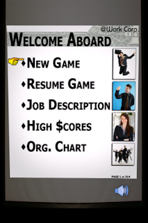
When you first start up the app, you get to a menu where you can start a new game, resume a game if you have one saved, view the help files, view the scores, and view the game's credits. The game is supposed to mimic a day in the office and hence all the menu items have names that you would encounter at a work place like organizational chart (credits) and job description (help).

The help is very detailed and includes an overview of the game, the gameplay, how the scoring works, what blocks you will encounter, and power-ups. If you don't have a saved game and you choose resume, the game beeps at you and you stay on the menu screen.

The menu illustrations and icons are, for lack of a better word(s), funny and hilarious and give off an Office Space jibe. When you start a game, there are two modes: Single Player and Multiplayer. The only different is that in Multiplayer (aside from the obvious fact that you are playing against someone else) you have an extra button that lets you throw blocks at the other player in hopes they run out of room before you do.


In the high scores you can view your score for each of the three game modes (more on that below) both locally (where you are matched against pre-set scores) and globally. My best is 61k and someone has managed to break 2 million. It's a cat-eat-mouse world out there.


When you start the game, you get to select between three game modes. In Normal, you make matches until you run out of room and the goal is to survive as long as possible (and hence to get as high a score as possible). In Quota 250, the game ends whenever you run out of room or hit 250 blocks matched, whichever comes first, and the goal is to get the highest score possible within the 250-block limitation. This mode is great for quick games although the saving feature is so-well implemented in this game that you can just play Normal mode and keep pausing it. In Cram Down you get bombarded with save blocks (more on that later).


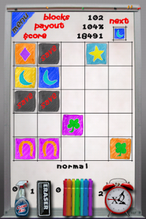
The main game screen resembles a white erase board. There's a Menu button that lets you go back to the main menu (and saves your game). It's very responsive which makes this a great game to play a couple of minutes at a time. On the top you have how many blocks you have cleared so far, the payout, and your current score. You can also see which block is coming next and clicking on it makes it appear immediately, speeding up the slower levels once you start getting good at this game. Every 30 blocks you get a performance review which results in adding to the Payout percentage, which is the score multiplier. The better you do, the higher the "raise."

You can match blocks based on shape or color. I set up the following on the board:

Red block shape 1
Red block shape 2
Orange block shape 2
Orange block shape 3

And everything but the last one disappeared. So still not sure how it handles mixing shapes and colors, since it did the transition from shape 1 to 2 but not 2 to 3. The developer explained that the reason he didn't want to have colors to the left and shapes to the right and have a tile that has the color to the left and the shape to the right erase all five (it just does one or the other, not sure how it makes the decision which way to go) is because he wanted to keep a certain level of difficulty to the game.

On the bottom there's the game mode and the power-ups. The windex clears the entire board, the eraser clears one block at a time, the markers color the blocks, and the clock gives you a score multiplier. To use a marker you first click on them and then slide your finger left or right to highlight a marker color. It shows how many of each power-up you have. Something I dislike about the game is that if you have multiple power-ups you have to click on them to de-select them. For example, if I have two erasers and I click on the eraser and then on a block in the game board, the block gets erased. If I then click on another block, I use up the other eraser. I'd much prefer to have to re-select the power-up if I want to use it again and if I don't do that I just go back to selecting blocks. The developer made a good point that when it gets frantic it's better to have this mechanism, and after thinking about it I agree. He provided the tip that if you have erasers, you can click on Save blocks to have them erased without having to click on the eraser tool first.


Now we come to the pesky Save blocks. You cannot match them, you cannot move them. You can only get rid of them with an erase or windex. They are going to be the cause of losing most of your games. Save yours erasers for them. This block adds a whole other dimension to the gameplay. Your four tiles with a space in the middle become worthless all of a sudden:

X X X X
S A V E


Which shows that you can never plan the future too concretely.

Another great feature is that blocks appear on the screen in random squares. So that if you have

X  O  O  X  X


with the Xs being blocks of the same color and the O being empty spots, and you plan to put another X where the left-most O is, the game will ruin it for you and place it randomly on the rightmost O, making a match of 3 instead of the 5 you were planning for.

The more you match, the more the power-ups. The most I've been able to match is five. I have an idea for seven but I haven't been able to execute it yet:

XX XX
X
X

and drop a block right in the middle.

A huge part of this game is the sounds. There's no music but the sound effects make this game an engrossing experience. There are random sayings such as "You work for us!," You set low standards and consistently fail to meet them," and "Let's get to work!". Game over? "Maybe you should take a break." This is supposed to mimic the abuse at the mercy of bosses, and it does so satisfyingly well. This is one game you don't want to play with the sound off. There are beeps when you select menu items. There's a little speaker icon on the bottom right of the menu screens that lets you turn the sound on or off. This is a great feature. When you are in the game there's a beeping noise when you clear lines, a bell-like noise when you get a power-up, an erasing noise when you use the eraser (I see what they did there), and there's no sound when you use the markers.


The screen where you enter your name for that game's score is the best one I've seen so far in the app store. It's one of those ubiquitous pink Important Message slips. Please tell me I'm not the only one that tapped on Urgent to see if a checkmark would appear there.

Other than how multiple power-ups are handled, I would like the title screen to show up for more than a second (I like how it looks and I would have loved to take a screenshot of it for this review).


Once you start getting used to the power-ups and once you start making big matches the fun really begins. There's a lot of depth to this game and a lot of quick decisions to be made. The game combines humor, polished and thematic graphics, hilarious sounds, inventive and useful power-ups, and a great scoring system to deliver not just a game, but a really engrossing experience. For example, let's turn out attention to the screenshot that shows the raise percentage received. I got about 7 raises before I was able to take the screenshot. I was having so much fun and was so engrossed in the game, I kept forgetting to take the screenshot. This review would have come out a whole quicker if the game wasn't so much fun. Highly recommended.